Everyone already has what they need. Youniverse's work is helping them see it.
A coaching, counselling and management training company that works on two fronts: the individual and the organisation. The brief asked for an identity that could speak to both without splitting in two: elegant, clean, professional.
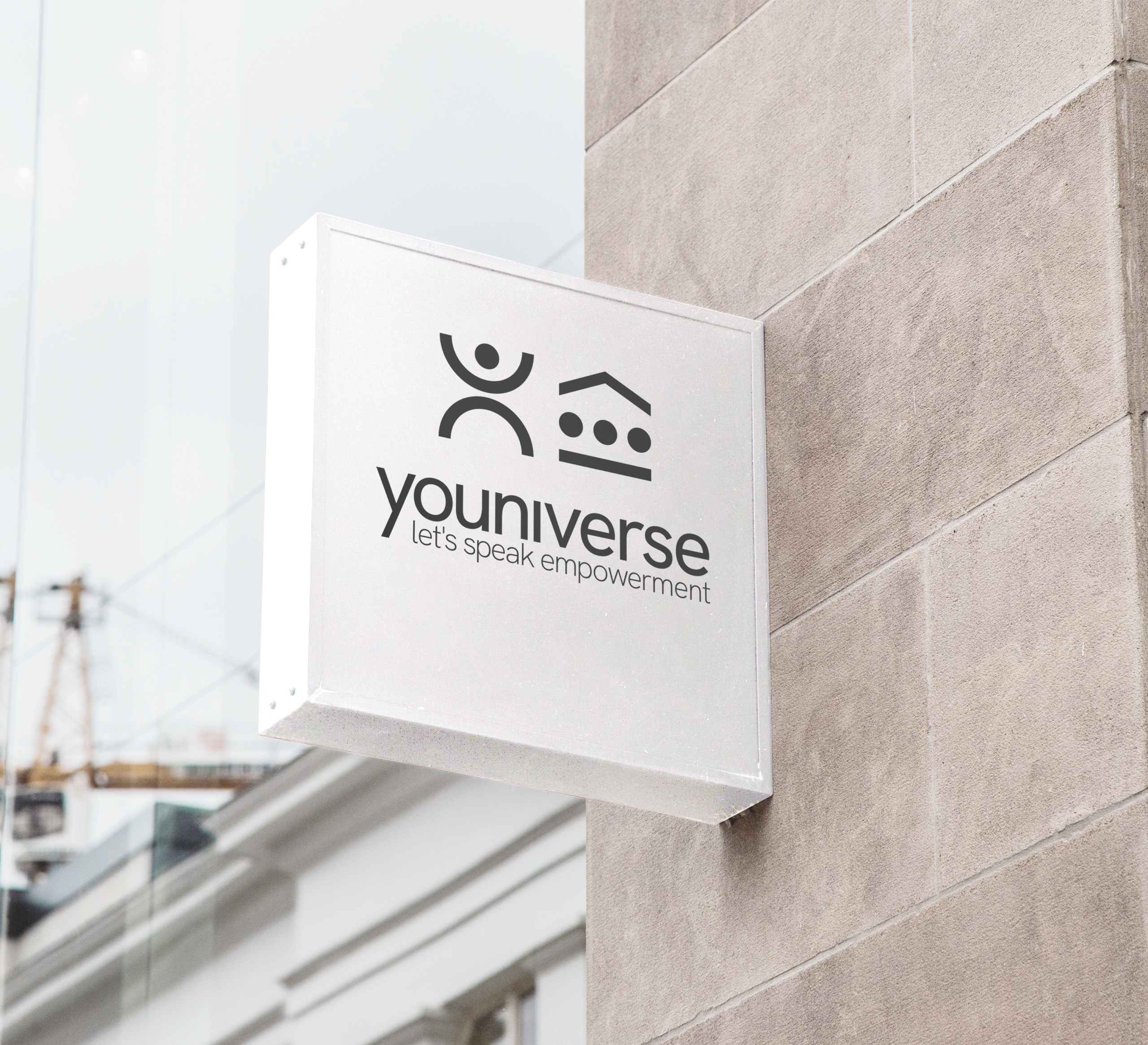
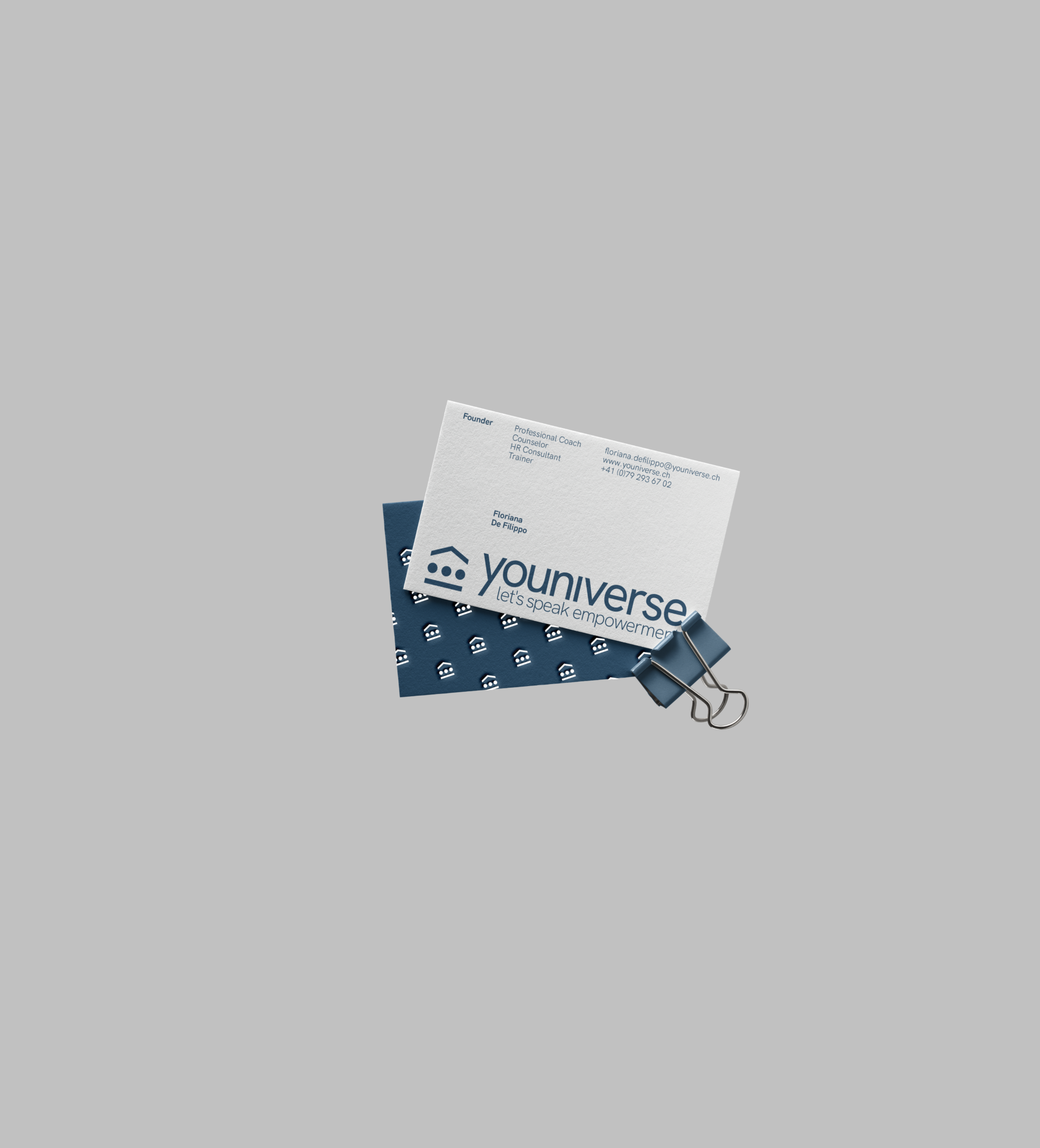
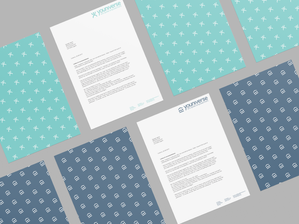
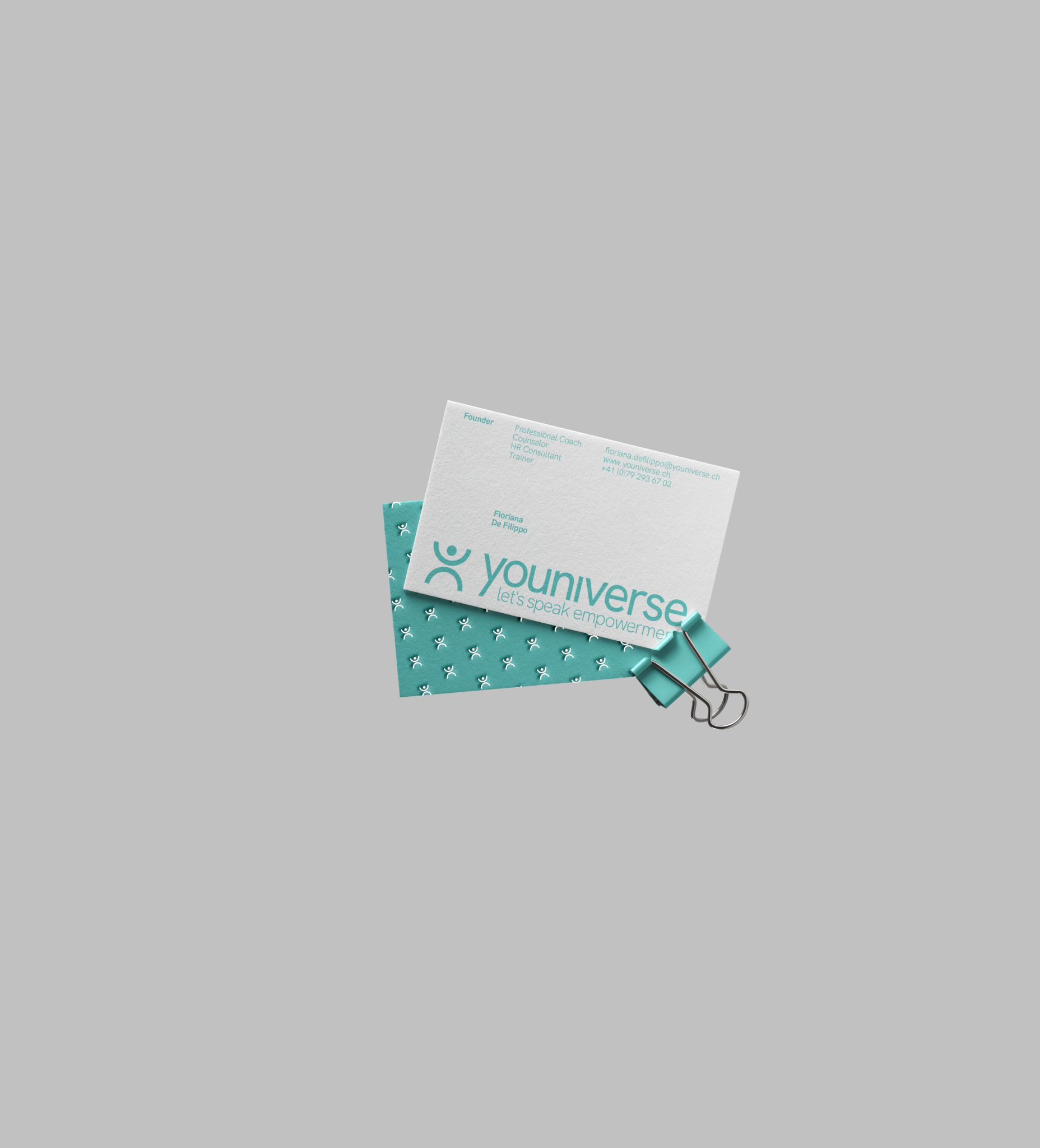
The answer is a dual-mark system: a human figure with raised arms, the Y of Youniverse, a body opening up, alongside an icon for the company structure. Two marks that live side by side, interchangeable depending on who is looking. Recognisable either way.
A flexible identity for work that, at heart, is always the same: bringing out what is already inside.
Client: Youniverse
Year: 2019